
“Show, don’t tell” is an idiom commonly used by writers of all stripes. The idea itself is simple: don’t tell your readers what to think, feel, or expect about your topic. Instead, you want to “show” them the data, facts, and evidence as concisely and as powerfully as possible. When done well, you are far more likely to instill whatever you were trying to communicate in a way that’s lasting and powerful.
Infographics are an incredibly effective way of distilling sometimes complicated data into something succinct and visually impactful. They take data that may be difficult for our brains to process through words and allow the significance of the data to shine through. It’s no surprise, then, that an infographic is up to 30 times more likely to be read than an article.*
That being said, not all infographics are created equal. Here are 5 tips to ensure yours are as effective as possible.
Tip 1: Start With the Data
Not all information is best communicated visually. If the message you’re trying to communicate can be effectively stated and easily digested in one or two sentences, it probably ought to be.
It may be tempting to add fun graphics and visual elements to every part of your blog, whitepaper, or website content, but there are reasons to keep information as text. Text has a huge impact on SEO, or Search Engine Optimization, while images will have very little. Don’t just take text content and turn it into an image.
Instead, use infographics for data that tells a story. Infographics can be much more effective as communicating statistics than paragraphs of text. Moreover, a simple, visual representation of data can leave a very strong and very obvious impression.
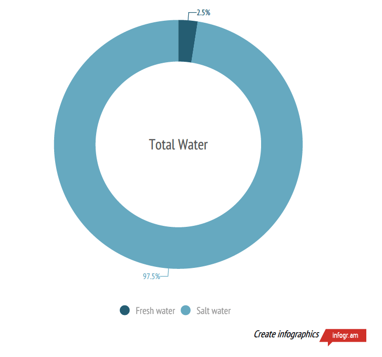
This infographic is extremely simple, but it immediately conveys the narrative of the data: that fresh water is scarce. It takes information that’s well-suited to an infographic and employs it in an impactful way.
Tip 2: Less Information is More Impactful
Have you ever seen a graphic that looked stylish but was difficult to interpret?

This wonderfully ironic infographic tries to answer the question of whether your content should be visual or not. Unfortunately, this incredibly busy flowchart would be much easier to read as five separate infographics, not one. Don’t get bogged down in details. Boil your information down to what’s most important – anything else will obscure, not clarify.
Tip 3: Respect the Data
Once you’ve chosen what to make into an infographic, let the demands of the data dictate what that infographic looks like. It may be tempting to format your graphic with flashy visuals or unusual graphs, but you should only do so when it benefits the digestibility of the data. Infographics should always make data easier to understand, not more difficult. And it should always represent that data as accurately as possible.
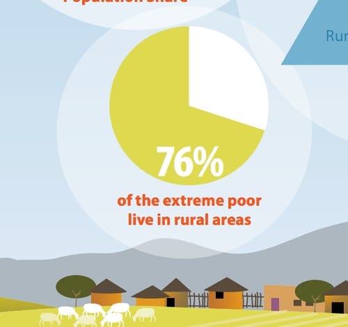
This unfortunate pie chart is mysteriously not 76% shaded. Not that your graphics must be accurate down to the last pixel, but make sure it actually represents the information with integrity.
Tip 4: Not Too Big, Not Too Small
If an infographic is too large, it will require excessive amounts of scrolling and may be almost entirely un-viewable on a mobile device. If it’s too small, it may not be legible.
Make sure text is large enough to be legible even when viewed at 50% magnification. Generally speaking, a good width for an infographic is 600 – 800 pixels.
Some infographics are long and meant to be scrolled through. To meet best practices, we advise not usually going over 8000px long.
Tip 5: Share It!
Infographics can be a really impactful marketing tool, but only if you actually use them.
- The same graphic can be used across blogs, websites, and whitepapers. Get the full value out of your design!
- Make sure your infographic is easily shareable on social media – consider using plugins to add a Facebook share button or a “Pin It!” Pinterest button.
- Share it, ask users to share it, and ask reputable partners in your niche to share it. Promote it the same way you would promote any of your valuable content.
Conclusion
As primarily visual creatures, infographics have the ability to immediately captivate and communicate in a way that words can’t. However, a little goes a long way! Remember to focus on the story that the infographic tells – the significance of the data it’s representing – in order to make the most interesting and shareable graphic possible.